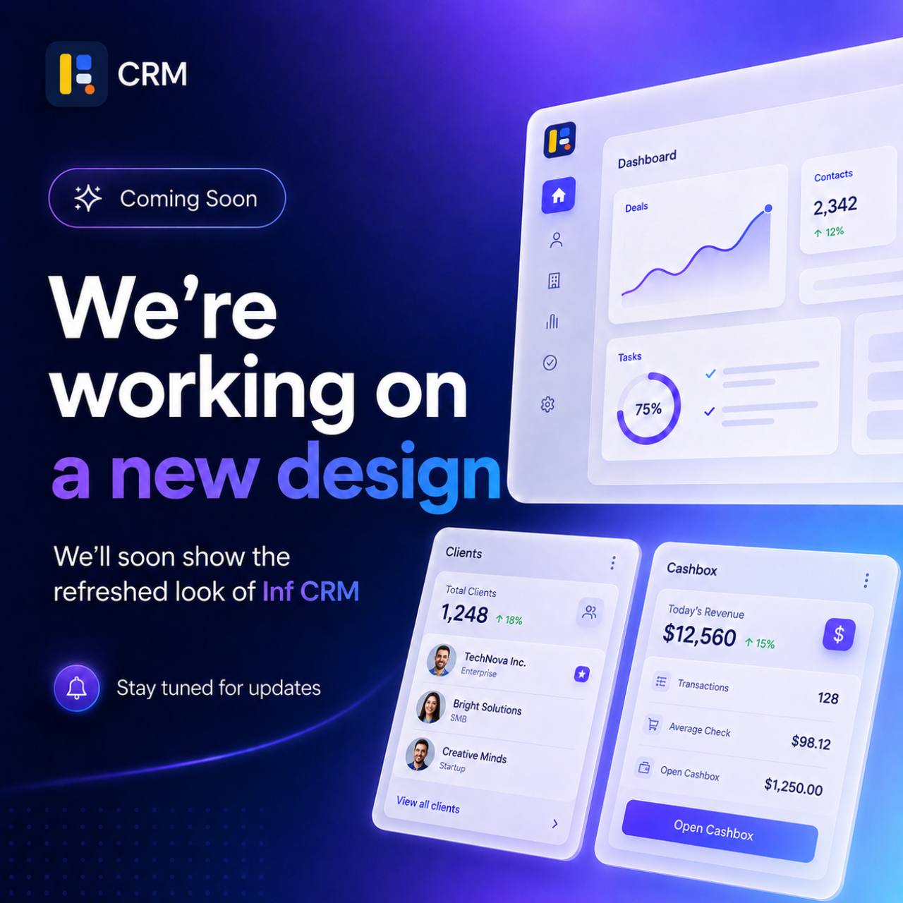
A cleaner workspace is coming
We are actively working on a refreshed Inf CRM design. The goal is not only to make the product look newer, but to make everyday work inside the CRM faster, clearer and more comfortable for owners, managers, reception teams and trainers.
The new direction follows a softer blue-gray workspace, white primary surfaces, restrained shadows and consistent rounded UI patterns. It keeps Inf CRM familiar while giving the interface a more focused operational rhythm.
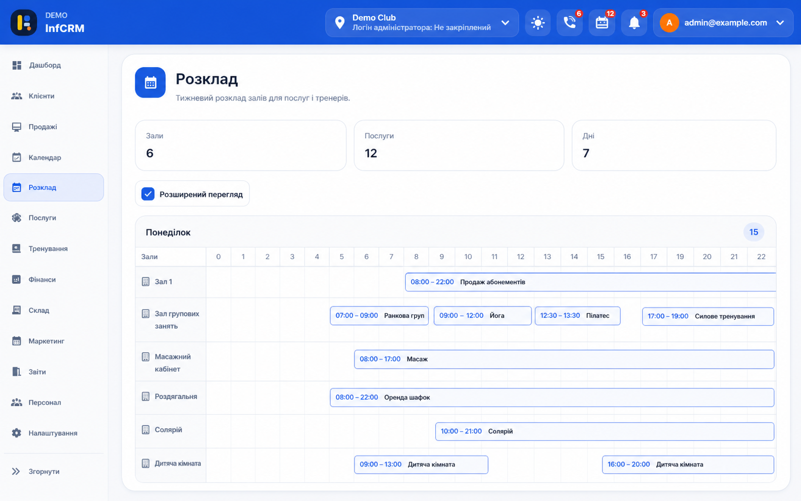
What we are improving first
The first design wave focuses on navigation, dashboards, cards, forms and dense operational pages. We are paying attention to the screens that teams open many times a day: clients, schedule, cashbox, analytics and task flows.
The redesign also prepares a stronger responsive foundation, so the interface feels more stable across desktop, tablet and mobile devices. Important actions should stay visible, data should be easier to scan, and layouts should avoid unnecessary visual noise.
A shared design system behind the scenes
A redesign becomes useful only when it stays consistent across the whole product. That is why we are shaping a shared design system for surfaces, buttons, forms, cards, badges, tables, empty states and responsive page layouts.
This work helps us move faster after the first release. New modules and future improvements should not feel like separate experiments: they should follow the same spacing, typography, states and interaction patterns.
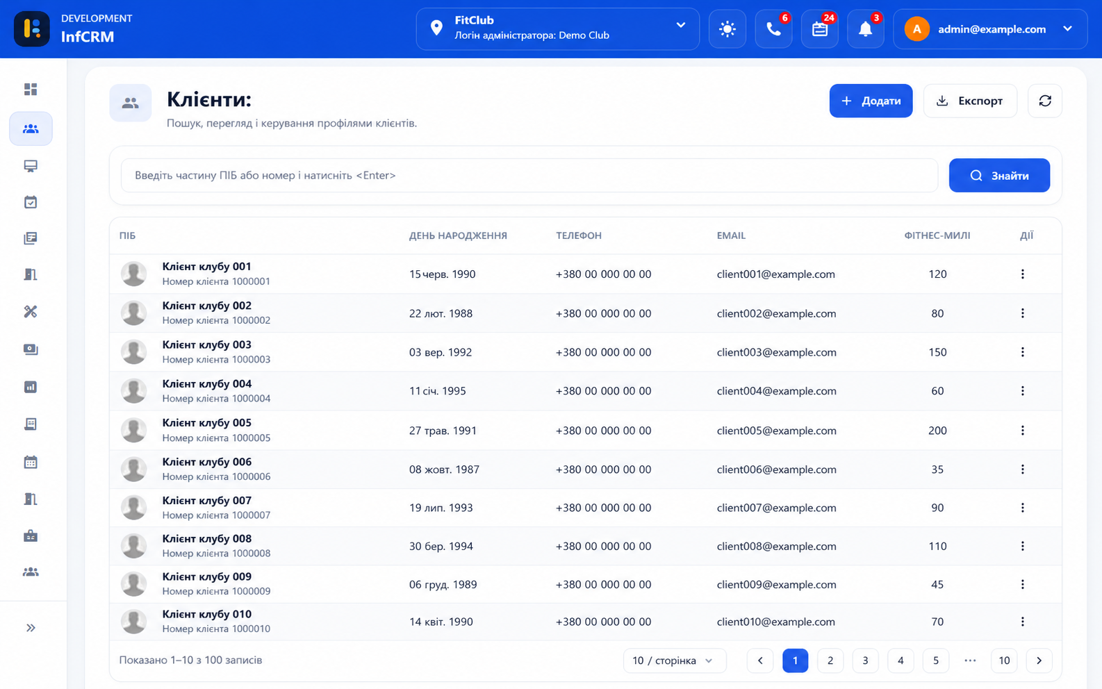
Better for daily club operations
Inf CRM is an operational product, so the redesign is not about decorative screens. We are reviewing how managers compare numbers, how front desk teams close cashbox shifts, how trainers find clients, and how owners scan business health.
The practical target is simple: fewer distractions, faster orientation and more predictable controls. The interface should help a club team complete repeated daily actions without slowing them down.
We will share more soon
The announcement images show the direction we are moving toward. We will publish more previews as screens move from design into implementation.
Follow our updates on Instagram and on this blog: we will use both channels to show progress, explain decisions and collect feedback before the refreshed experience reaches customers.